This is why a clean 960px grid still rocks (give a chance to 1200px too)
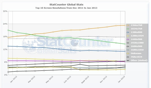
Studies reveal as a matter of fact, that many users are switching to even wider screens and higher resolutions, so designing in yet old 960px grid is a good choice, but have in mind that 1200px grid layouts can become more popular. 16:9 aspect ratio screens are becoming a trend instead of the 4:3 ones, this will make in the long run absolutely worth to take advantage of that leftover space.
Statistics show how 1024×768 resolution (4:3) has been decreasing its popularity, contrasting with the 1366×768 resolution (16:9) that has been more popular.
Of course the idea of the 1200px grid is not new at all, but it’s not widely implemented due to the common belief that 4:3 resolutions are still the main rule referring to big screen devices such as PC’s and their portable variations. There are nice tools like Boilerplate which allows the creation of content from the 1200px grid, but can be customized to start from 960px or any width.
Another one is Percentage based CSS grid system, which dynamically adjusts responsive content starting from a 1200px layout, and it turns out to be a nice approach. Hence, if you’re having huge expectations and want to take advantage of a widescreen resolution, think outside the 4:3 box, and get used to this idea because it will become trendy for sure.